


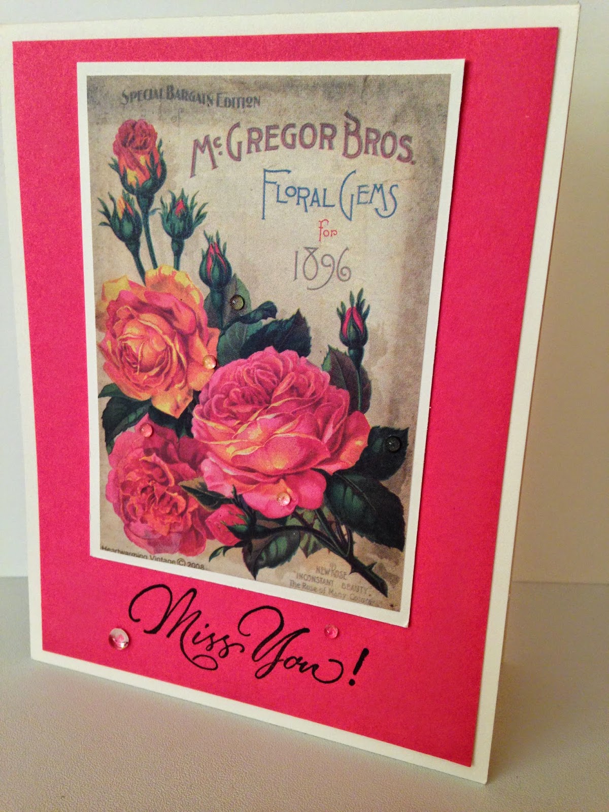
My second is for the last challenge from Serendipity #34, I know it ended yesterday and still wanted to share my card. It was a very quick Miss You card using an image from a Summertime Image and Journal Notes pad, so very quick and easy and I also added some of those wonderful Rainstones from PTI, I love those little things. Thank you so much for stopping by...enjoy your week and see you soon!

Ingredients
ColourQ
Solid Card Stock: SU - Night of Navy and Michael's - White
Ink: SU - Night of Navy, Bermuda Bay and Strawberry Slush and PTI - New Leaf
Stamps: PTI - Funky Florals
Dies: PTI- Wonderful Words - Thank you
Pearls: SU
Serendipity
Solid Card Stock: PTI - Ivory and Hibiscus Burst
Stamps: Serendipity - Miss You
Ink: VersaFine - Black
Image: Crafty Secrets - Summertime Images
Rainstones: PTI
These are absolutely gorgeous creations. Both with such wonderful colouring.
ReplyDeleteHugs
Desíre
{Doing Life – my personal blog}
Love both of your pretty floral cards Kim!! One with a modern look and one vintage!!
ReplyDeleteI so enjoy those Funky Florals, and what you did with them is amazing! they always show off so well with different colors and using all the fun little embellished stamps!
ReplyDeleteFabulous cards. I really love the stamping on your first one.
ReplyDeleteWhat fun, bright colors...
ReplyDeletelove that explosion of color with all the blooms!
And a simple perfect vintage creation! :)
What lovely cards Kim!! The first card is so pretty. I love the stamp set you chose for it. The navy sentiment was the perfect choice for the sentiment too!!
ReplyDeleteThat second card is lovely. Oh so simple but so pretty!! Fabulous design on both!!
Kim i love the colourQ colours this week so much! Your cad is super gorgeous, I love that stamp set for them. You mimicked the table cloth perfectly! LOVE your design! The Serendipity card is beautiful!
ReplyDeleteThese are both fabulous. I especially like how you layered all those colors for the ColourQ card.
ReplyDeleteHow do I love those funky florals? Let me count the ways! Fantastic take on the colourQ colors!
ReplyDeleteFantastic cards, Kim! I love how your first card looks like a beautiful fireworks display! And your second card reminds me of a vintage Valentine!! Really cool!! Hugs, Darnell
ReplyDeleteFabulous!! Love the stamps you used for the first card, they look like fireworks and work perfectly with those colours. And the second card is so sweet, a white frame always makes cards look so crisp and clean, its gorgeous. Hope your week is going well and your settling back into school life. How many sleeps till the next school holidays????
ReplyDeleteLove the Colour Q card those colors are outstanding.
ReplyDeleteThe flowers on the first look amazing - I have that set and I never would have tried this. The overstamping looks great - what beautiful stamping. I have to be more daring. I also like the second with the pretty rose and the dew drops. You matched the cardstock perfectly to the image.
ReplyDeleteKim, two fabulous cards; both featuring flowers, yet so unique in their presentation. Love the vibrant artsy fun of the first, and the rose-sophistication and elegance of the second. Fun and classy, all in one post...LOVE it!!
ReplyDeleteHugs~c
Love the bright colored modern look on your first card, just gorgeous! And the vintage card is so pretty.
ReplyDeleteThese two cards are so delightful!! The first one so bright, so bold, so bursting with color!! The second one - so sweet, so tender, so heart touching!! You did an amazing job - good for you!!
ReplyDeleteWow--you've been so productive making gorgeous cards! I really love the first one--incredible stamping, Kim!
ReplyDeleteSorry, I'm soooo behind, Kim ... you'll see me a few times as I catch up! What a stunning riot of gorgeous colour ... those overlapping blooms are just beautiful! Your second card is just chock full of sweet elegance ... the rainstones are so perfect! Thanks so much for the lovely shoutout, my friend! Anita :)
ReplyDelete